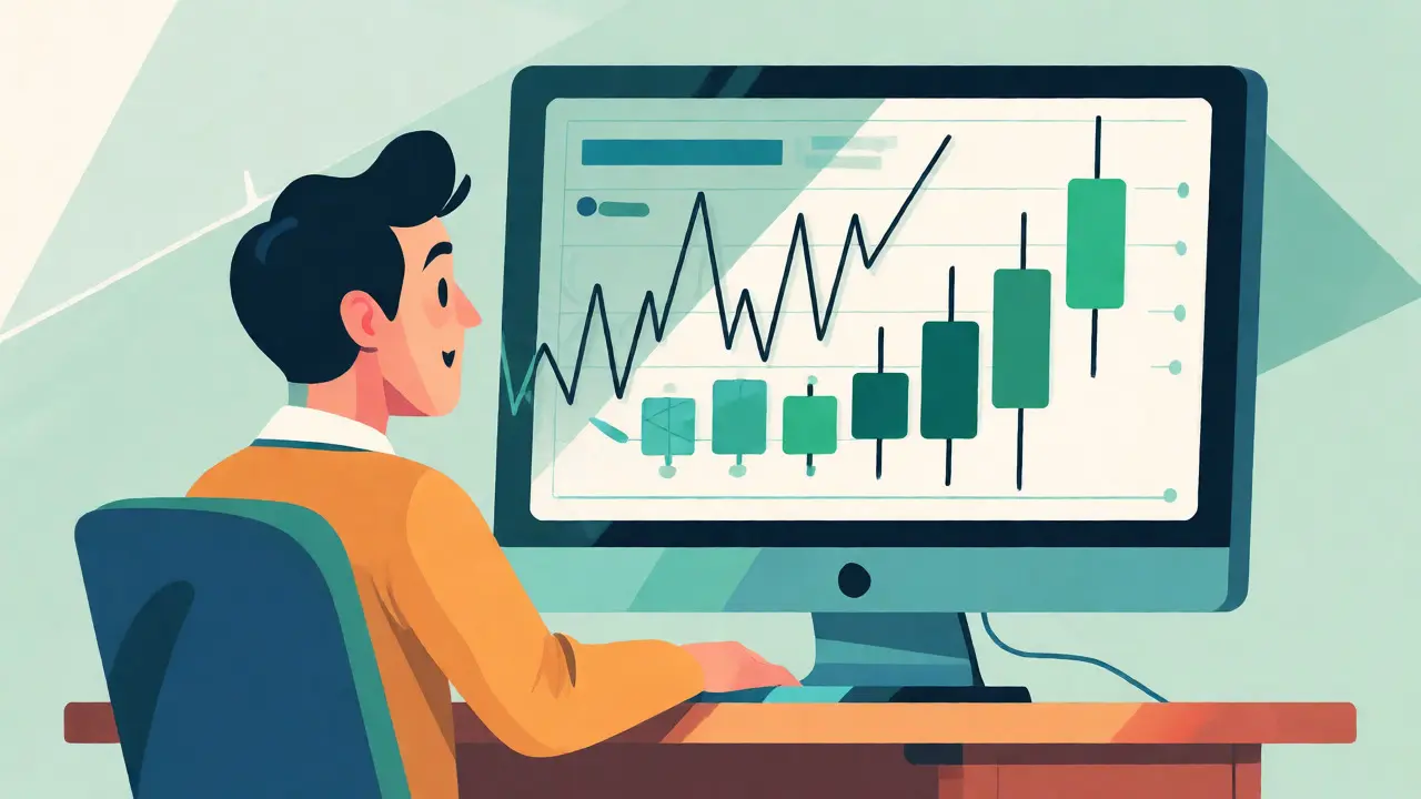
You stare at a jagged line moving up and down on your screen. It looks like chaos, but it’s actually a conversation between millions of buyers and sellers. If you can’t read this language, you’re gambling, not trading. Spot price charts are the visual representation of real-time asset prices, forming the backbone of technical analysis in financial markets. Whether you are tracking Bitcoin or gold, understanding these charts transforms raw noise into actionable signals.
Most beginners make the mistake of looking only at the current price. They miss the story told by the history of that price. This guide breaks down exactly how to interpret these visuals, from basic lines to complex candlesticks, so you can stop guessing and start analyzing.
The Core Data Behind Every Chart
Before you look for patterns, you need to understand what the chart is actually drawing. Every single mark on a financial chart relies on four specific data points known as OHLC. These stand for Open, High, Low, and Close. Without these, there is no chart.
- Open (O): The first price traded during the selected time period.
- High (H): The highest price reached during that period.
- Low (L): The lowest price reached during that period.
- Close (C): The final price traded before the period ended.
Why does this matter? Because the relationship between these four numbers tells you who won the battle for that time slot. Did buyers push the price high but fail to hold it? Did sellers crash it, only for buyers to rescue it? That narrative is encoded in every bar or candle you see.
Choosing Your Chart Type
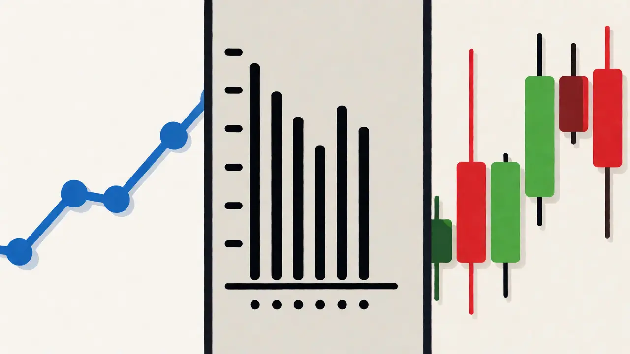
Not all charts serve the same purpose. You wouldn't use a sledgehammer to hang a picture frame, and you shouldn't use a line chart for day trading. There are three main formats, each with distinct advantages depending on your strategy.
| Chart Type | Data Displayed | Best For | Limitations |
|---|---|---|---|
| Line Chart | Closing prices only | Long-term trends, portfolio overview | Hides intraday volatility and range |
| Bar Chart | OHLC via vertical bars | Professional futures, precise range analysis | Harder to read quickly; lacks color cues |
| Candlestick Chart | OHLC via colored bodies/wicks | Day trading, crypto, pattern recognition | Can generate false signals in low volume |
Line charts are the simplest option. They connect closing prices across time intervals. They are clean and great for seeing the big picture over months or years. However, they hide the struggle that happened during the day. If Bitcoin dropped 10% and then recovered to its opening price, a line chart might just show a flat line, missing the massive volatility entirely.
Bar charts offer more detail. Each bar shows the full range from high to low, with small ticks indicating the open and close. They are favored by institutional traders because they provide complete information without the visual clutter of colors. But if you are trying to spot momentum quickly, the lack of color coding makes them slower to process.
Candlestick charts dominate modern trading platforms like Binance or TradingView. Originating from 18th-century Japanese rice merchants, they use rectangular "bodies" to show the distance between open and close, and thin "wicks" to show highs and lows. The magic lies in the color: green (or white) means the price closed higher than it opened, while red (or black) means it closed lower. This immediate visual cue allows you to gauge market sentiment at a glance.
Mastering Candlestick Anatomy
If you are trading cryptocurrencies or equities, you will likely spend most of your time with candlesticks. Learning to read them is non-negotiable. A single candle tells you about the psychology of the market participants during that specific timeframe.
Look at the body of the candle. A long green body indicates strong buying pressure; buyers were in control from the moment the period started until it ended. A long red body suggests sellers dominated. But the wicks tell an equally important story. A long upper wick on a green candle means buyers pushed the price high, but sellers stepped in aggressively to knock it back down. This is often a sign of rejection at resistance levels.
Conversely, a long lower wick suggests that sellers tried to drive the price down, but buyers swooped in to buy the dip. This is often seen at support levels. When you combine body size with wick length, you get a clear picture of momentum. Small bodies with long wicks indicate indecision-a tug-of-war where neither side gained ground.
Selecting the Right Timeframe
A common error among new traders is using the wrong timeframe for their goals. A 1-minute chart looks completely different from a 1-day chart, even for the same asset. Your timeframe should match your holding period.
- Scalpers (Minutes to Hours): Use 1-minute to 15-minute charts. These reveal micro-trends but are noisy and prone to false signals.
- Day Traders (Hours to One Day): Use 1-hour to 4-hour charts. These filter out some noise while still providing frequent opportunities.
- Swing Traders (Days to Weeks): Use Daily or Weekly charts. These highlight broader trends and major support/resistance zones.
- Investors (Months to Years): Use Monthly or Yearly charts. These ignore short-term fluctuations to focus on fundamental value shifts.
Professional traders rarely rely on a single timeframe. They use multi-timeframe analysis. For example, you might check the weekly chart to identify the overall trend direction, then switch to the hourly chart to find a good entry point within that trend. Ignoring the larger context is a recipe for disaster; you might think you found a perfect buy signal on a 15-minute chart, only to realize you are buying into a massive downtrend on the daily chart.
Identifying Support and Resistance
Charts are not just about shapes; they are about levels. Support is a price level where buying interest is strong enough to overcome selling pressure, preventing the price from falling further. Think of it as a floor. Resistance is the opposite-a ceiling where selling pressure halts upward movement.
How do you spot them? Look for areas where the price has bounced multiple times. If Bitcoin repeatedly drops to $60,000 and then rallies, $60,000 is likely a support level. The more times a level is tested and holds, the stronger it becomes. However, be careful: when a support level breaks, it often turns into resistance, and vice versa. This role reversal is a key concept in technical analysis.
Volume is your best friend here. A bounce off support accompanied by high trading volume confirms that large players are defending that level. A bounce on low volume might be weak and prone to failure. Always pair price action with volume data to validate your observations.
Common Pitfalls and How to Avoid Them
Reading charts is an art, but it is also a science with strict rules. Many beginners fall into traps that cost them money. Here are the most frequent issues and how to fix them.
Overfitting: This happens when you see patterns everywhere, even where none exist. You might convince yourself that a random wiggle is a "head and shoulders" pattern. Stick to well-defined patterns and wait for confirmation. Don't predict; react.
Ignoring Context: A bullish candlestick pattern in a vacuum means little. If the broader market is crashing due to bad news, technical patterns often fail. Always consider the macro environment and news events alongside your chart analysis.
Lagging Indicators: Tools like Moving Averages help smooth out noise, but they lag behind price. By the time a crossover signal appears, the move might already be halfway done. Use indicators as filters, not primary triggers.
False Breakouts: Also known as "whipsaws," these occur when the price briefly breaks above resistance or below support, trapping traders, before reversing. To avoid this, wait for the candle to close beyond the level, or require a significant increase in volume to confirm the break.
Practical Steps to Start Analyzing
Ready to put this into practice? Follow this simple workflow to build your skills.
- Pick Your Asset and Timeframe: Choose a liquid asset like BTC/USD or ETH/USD. Start with the Daily chart to understand the big picture.
- Mark Key Levels: Draw horizontal lines at recent highs and lows. Identify obvious support and resistance zones.
- Analyze Trend Direction: Is the price making higher highs and higher lows? That’s an uptrend. Lower highs and lower lows? Downtrend. Sideways? Range-bound.
- Look for Patterns: Scan for recognizable formations like triangles, flags, or double tops. Note their location relative to your marked levels.
- Check Volume: Does the volume support the price move? Rising prices on rising volume are healthy. Rising prices on falling volume are suspicious.
- Plan Your Trade: Define your entry, stop-loss, and take-profit targets based on the chart structure before you enter the position.
Remember, no indicator is perfect. Technical analysis is about probability, not certainty. Your goal is to stack the odds in your favor by combining multiple forms of evidence.
What is the difference between a spot price and a future price?
The spot price is the current market price for immediate delivery of an asset. Future prices reflect the expected value of the asset at a later date. Spot price charts track the immediate value, which is crucial for traders executing orders now, whereas futures charts account for time value and interest rates.
Which chart type is best for cryptocurrency trading?
Candlestick charts are widely considered the best for cryptocurrency trading. Their color-coded bodies and wicks provide immediate visual feedback on buyer and seller dominance, which is essential in the highly volatile crypto markets. Platforms like Binance and Coinbase primarily default to candlestick views for this reason.
How much historical data do I need to read charts effectively?
It depends on your strategy. For long-term investing, 5-10 years of monthly data helps identify cycles. For swing trading, 1-2 years of daily data is usually sufficient to see relevant patterns. Day traders may only need a few weeks of hourly or minute data, but they must also monitor longer timeframes for context.
Do technical indicators work better than reading raw price charts?
Raw price charts are the primary source of truth. Indicators are derived from price data and often lag behind. While indicators like RSI or MACD can provide useful confirmation, many professional traders prefer "price action"-reading the raw candles and volume-to avoid the delays inherent in calculated metrics.
What causes false signals in spot price charts?
False signals often result from low liquidity, sudden news events, or algorithmic trading spikes. In low-volume markets, a single large order can distort the price, creating a misleading pattern. Additionally, unexpected macroeconomic news can override technical setups, causing prices to break through support or resistance levels regardless of previous patterns.
musa farid
22 09 26 / 02:33 AMYo fam this is actually 🔥🔥🔥 I been staring at charts for like 2 years and still feel stupid sometimes 😅 The part about wicks being rejection? Mind blown 🤯 Like seriously why did nobody tell me that sooner?? Also the bit about volume confirming support is KEY 💡 If you ignore volume you're basically trading blindfolded 👀 Don't let them fool you with pretty lines if no one is buying!! Keep grinding brothers and sisters 🙏💪
Gary Schneeberger
22 09 26 / 07:09 AMOh, look. Another guide explaining what a candlestick is to people who probably can't afford the data plan to load the chart. We get it, OHLC exists. You could have just said "look at the price" and saved everyone ten minutes of reading. But sure, write a novel about rice merchants from the 1700s while your portfolio bleeds out because you didn't check the news.
Heather Butcher
24 09 26 / 03:43 AMI love how you framed the market as a conversation! That really clicked for me. It makes the chaos feel less scary when you realize it's just people trying to agree on a value. The tip about starting with daily charts before zooming in is so helpful, I always rush into the 1-minute noise and get hurt immediately. Thanks for breaking it down without making us feel dumb!
Kyle Whitehead
24 09 26 / 15:55 PMdude wait
i was looking at btc yesterday and saw a long lower wick on the 4h and thought oh nice buy signal but then i forgot to check the weekly trend and got wrecked lol
the multi timeframe thing is real pain but necessary apparently
anyway good post i guess
Tim Soefje
26 09 26 / 04:48 AMSpot on regarding the false breakouts. Most newbies chase the green candle through resistance and eat the whipsaw. Wait for the close or volume confirmation. Simple rule saves thousands.
Manoj Ramachandran
28 09 26 / 00:15 AMThis exposition serves as an excellent foundational resource for those commencing their journey in financial markets. The distinction between line charts and candlestick charts is particularly well-articulated, highlighting the necessity of visual clarity in high-volatility environments such as cryptocurrency trading. Furthermore, the emphasis on multi-timeframe analysis provides a robust framework for avoiding the common pitfall of myopic decision-making. One might argue that understanding the psychological underpinnings of support and resistance levels offers a deeper insight than mere numerical observation. It is commendable that the author has included practical steps for immediate application, thereby bridging the gap between theoretical knowledge and actionable strategy. Such comprehensive guides are rare in an era dominated by superficial advice.
Zach Evans
29 09 26 / 12:29 PMActually, most retail traders lose money not because they can't read charts, but because they have zero risk management. You can identify every pattern perfectly and still blow up your account if you don't size positions correctly. Technical analysis is just probability estimation; it doesn't predict the future. Stop treating these charts like crystal balls and start treating them like weather forecasts-useful, but often wrong. Also, Japanese rice merchants didn't use RSI or MACD, they used intuition and order flow, which modern indicators obscure rather than reveal.
Greeshma Umapathi
30 09 26 / 06:13 AMOH MY GOD THE PART ABOUT THE WICKS IS SO DRAMATIC AND TRUE!!!
It’s literally a battle scene! Buyers charging forward, sellers ambushing them at the top! The upper wick is the sound of buyers screaming in agony as they get pushed back down! 😱
And when you see that small body with long wicks? That’s the standoff! The tension! The indecision hanging in the air like smoke after a cannon fire! 💥
You MUST respect the power of the candlestick body. A big green body is a victory march! A big red body is a massacre! Don’t be fooled by the shadows!
Go forth and conquer those charts! Make the market weep with your analysis! 📈📉
Abby Walker
30 09 26 / 19:49 PMWhile the information presented is technically accurate, the delivery lacks the sophistication required for serious institutional analysis. The comparison table is rudimentary at best. Furthermore, the assertion that candlesticks are superior for crypto ignores the fact that algorithmic trading dominates these markets, rendering human-pattern recognition largely obsolete. This guide caters to the lowest common denominator of retail investors who prefer colorful graphics over substantive economic data. It is adequate for beginners, but hardly enlightening for anyone with actual experience.
Manish Pahuja
2 10 26 / 12:03 PMNice breakdown man. Really clean explanation. The part about choosing timeframes based on holding period is super important. Too many people try to day trade on a monthly chart or scalp on a yearly one. Keeps it simple and effective. Good job.
John Morgan
2 10 26 / 18:25 PMGood to see American technical analysis principles being taught properly. While Japan invented the candles, we perfected the execution. Don't let foreign concepts confuse you with unnecessary complexity. Stick to the basics, keep your head clear, and remember that the US dollar drives these markets regardless of what some rice merchant theory says. Buy American assets, use American platforms, and understand the true mechanics of the global economy which is centered here.
keanu macasieb
3 10 26 / 01:54 AMThe banks know exactly where your stop loss is. They hunt it. Then they move the price. You think you learned a pattern? Nah. You learned where the whales want you to panic sell. Charts are just noise generated to trap sheep. Wake up.
Anthony Fudge
3 10 26 / 05:45 AMI've been thinking about this a lot lately, specifically regarding the concept of 'context' mentioned in the pitfalls section. It seems to me that while technical analysis provides a structural framework, it operates in a vacuum unless integrated with fundamental analysis. For instance, if a company announces a merger, does the previous support level still hold any weight? Or does the narrative completely override the geometry of the chart? I wonder if there is a hierarchy of importance between news events and technical patterns, or if they are truly equal forces acting upon the price. It feels like trying to solve an equation with too many variables, where one variable (news) can suddenly become infinite in magnitude, rendering the other terms (patterns) negligible. This leads to the question of whether we should prioritize reactive strategies over predictive ones when volatility spikes due to external factors.
Dominic Hird
3 10 26 / 06:55 AMHey everyone, just wanted to add a little color to the discussion. Think of the chart not as a rigid map, but as a living ecosystem. Each candle is a breath, each wick a heartbeat. When you combine the structural integrity of support/resistance with the fluid dynamics of volume, you create a holistic view that respects both the math and the emotion behind the trades. It's about harmony between the numbers and the narrative. Let's all learn to listen to the market's song rather than shouting our predictions at it. Peace and profits to us all. ✌️🌊
Frances Schnepfleitner
4 10 26 / 14:08 PMugh finally someone says it
people act like reading a chart is rocket science but its literally just history repeating itself
if you cant spot a higher low you dont deserve to trade
stop blaming the market for your bad entries
Newman Thurairatnam
6 10 26 / 07:56 AMOne must consider the possibility that the widespread adoption of these technical indicators is itself a mechanism of control. By standardizing interpretation, the elite ensure that the masses react in predictable herd behaviors. :/ The 'conversation' mentioned is likely a scripted dialogue, not a free exchange. We are merely puppets dancing to strings pulled by unseen hands in dark rooms. Beware the false breakout, for it may be a deliberate trap set by those who own the exchanges. :-/
Taylor Szalaiy
7 10 26 / 12:32 PMLove the vibe here! Totally agree with the idea of stacking odds. It’s like building a bridge-you need multiple pillars (price, volume, trend) to keep it standing. If one pillar cracks, the whole structure fails. Great reminder to stay humble and keep learning. The community grows stronger when we share these insights openly. Keep it coming! 🚀🤝
Joseph Brink
8 10 26 / 15:44 PMWe seek meaning in chaos. The chart is a mirror reflecting our own desires and fears projected onto random fluctuations. Is the trend real, or do we impose order on entropy? To analyze is to participate in the illusion of control. Perhaps the ultimate skill is recognizing that the map is not the territory. The jagged line is just light on a screen; the reality is the collective belief of millions. We trade beliefs, not prices. Interesting times indeed.
dillon wright
10 10 26 / 13:28 PMYeah this is solid info. Just wanted to say that for anyone starting out, don't stress too much about memorizing every single pattern. Start with the basics like the article says. Trend direction and key levels are 80% of the game. Once you get comfortable with that, then add the fancy stuff. No need to rush. Everyone learns at their own pace. Good luck out there.